dYdX Grants — crypto project website design concept
We put together a Figma concept of the dYdX grants program home page: six screens from the program's promise to the call to apply. There was no commission; the concept reproduces the structure and brand style of the live dYdX Grants site.
Challenge
dYdX is a decentralized exchange for crypto perpetual futures, and dYdX Grants is its grants program, funding projects in infrastructure, tooling, research, analytics, security, marketing, events and community. dYdX was not our client: we made this concept without a commission by recreating the home page of the program's live website. The site's audience is developers, researchers and community members who want funding for their ideas.
We made this crypto project website design concept without a commission: dYdX was not our client. Its subject is the home page of the dYdX Grants program site, and the mock-up reproduces that site's structure, headings and brand style: a dark gridded background, a violet accent, a monospaced typeface and hand-drawn underlines, arrows and ovals. The design and structure belong to the program site's authors, so in this case we look at how the home page takes an applicant from the first screen to the apply button and what each block does along the way.
A site like this is read by very different people: seasoned developers, researchers, content creators and newcomers thinking about a grant for the first time. The home page has to make sense to all of them at once, without jargon and without making anyone read the program rules just to decide whether applying is worth it. All copy is in English, phrases on the screens are short, and the essentials live in headings, buttons and labels that still read at a quick glance. Someone who is only looking around needs a second path — browsing the program's open tasks — while the “Apply for grant” button stays visible in the header next to the five menu sections.
Applicants want proof before promises: which projects have already been funded, what amounts to expect and who is behind the teams. The road to a grant also has several stages, from application to interview to offer, and each raises questions: whether US applicants can take part, how payouts work, which projects qualify, how long a reply takes, how to improve the odds and how often rounds happen. In the list, the question about US applicants comes second, right after how to apply. If the answers are hidden, people never reach the form.
Success for such a page means a person reaches the “Apply for grant” button already knowing the answers to the main questions: what gets funded here, for how much, how selection works and how long to wait. On the home page, funded projects come right after the first screen, and the questions and the application process come before the closing call to action, so each screen removes one doubt and leads to the next. The section subtitles and the first-screen counters in the mock-up are placeholders, and the concept has no data on real applicants, so we describe only how the screens work.
Solution
As on the program's site, the home page in the concept works as an applicant's journey: the program's promise and two buttons on the first screen, then projects, news, answers, three application steps and a closing call to action.
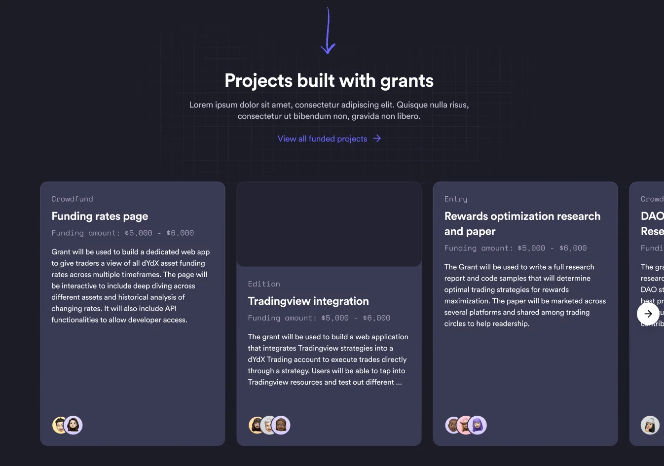
Project cards show a label, the project name, a funding range, a short description and contributor avatars, so there are people behind every amount. Labels and amounts share the monospaced face with the navigation, which keeps service details apart from the descriptions. Round news, a seven-question accordion and a three-card process remove the main doubts before anyone fills in a form, while the “Apply for grant” button stays within reach in the header, on the first screen and in the closing banner.
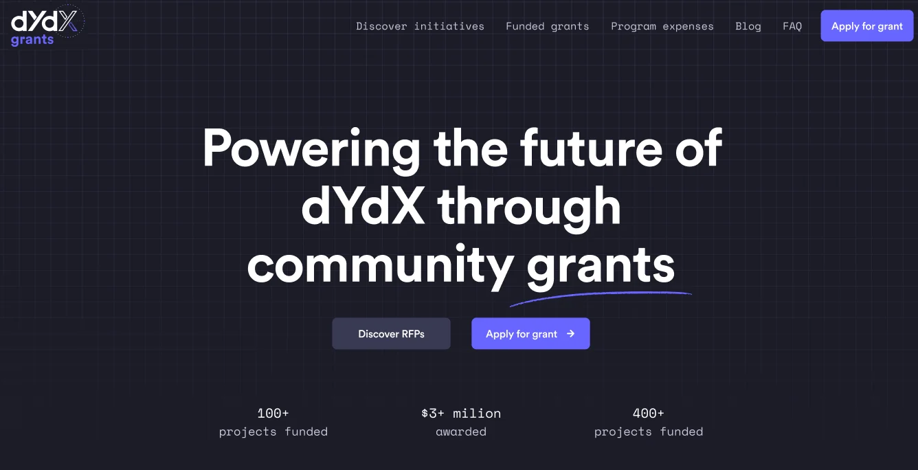
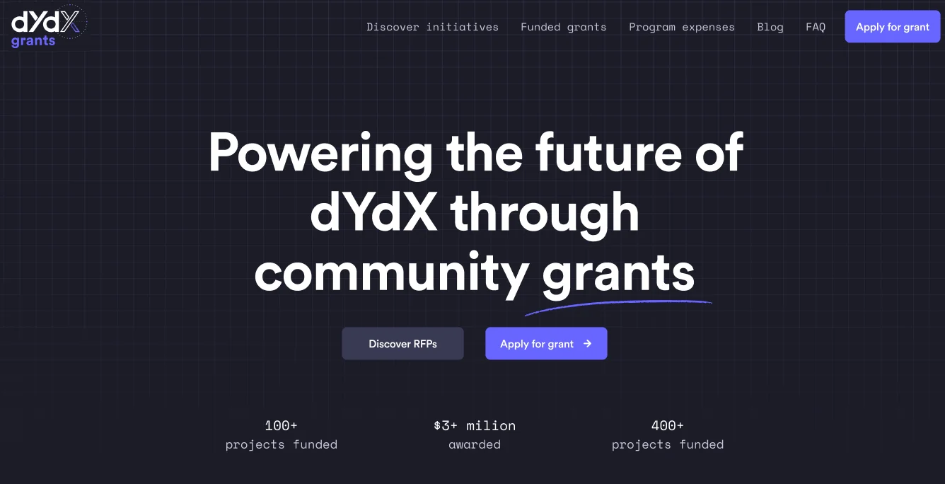
We assembled the home page in Figma as six screens in a dark theme with a violet accent and a faint background grid, just like the program's site. A monospaced typeface handles navigation, amounts and dates, while hand-drawn underlines, ovals, arrows and numerals mark the key point on each screen and lead the eye from block to block. The first screen has no photos or illustrations: the headline, the hand-drawn line and two buttons do the work. Cards, buttons and labels follow the same rules throughout, so the long page reads as one system.
A first screen for two scenarios
The headline “Powering the future of dYdX through community grants” has a hand-drawn underline under “grants”, followed by two buttons for different visitors: “Discover RFPs” for those looking for a task and “Apply for grant” for those who already have an idea. Below sits a row of three counters, and the header holds five sections: initiatives, funded grants, program expenses, the blog and the FAQ.
A carousel of funded projects
A hand-drawn arrow points down to the “Projects built with grants” section, which scrolls sideways: a round arrow button sits on the right, and the outer card runs off the screen edge to hint at scrolling. Each card shows a project label, the name, a funding range in a monospaced face, a short description and contributor avatars, and a link under the heading leads to all funded projects.
News about approval rounds
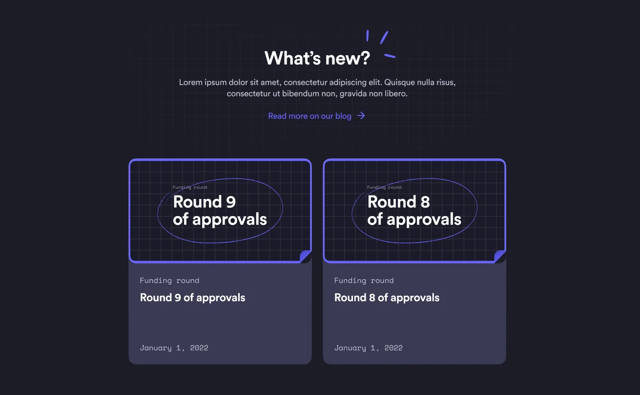
The “What's new?” block surfaces two recent blog posts: a gridded cover with a hand-drawn oval, a “Funding round” label, the round title and the publication date. Dates are set in the monospaced face, like the labels. The covers repeat the device used in the page headings, and the blog link sits right under the section heading, so nobody has to hunt for it in the menu.
Answers before applying
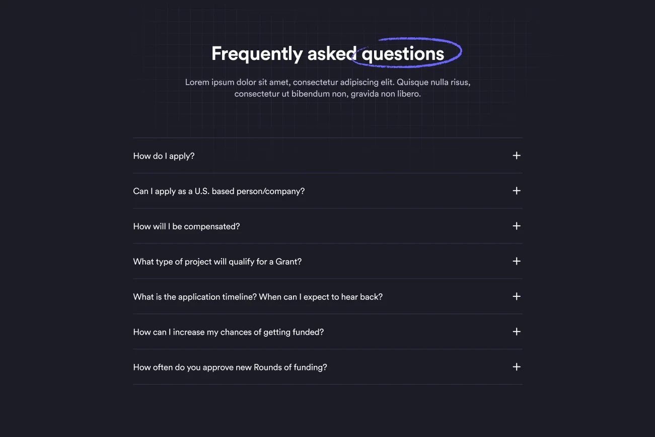
A seven-question accordion gathers what matters to an applicant: how to apply, whether US applicants can take part, how compensation works, which projects qualify, how long a reply takes, how to improve the odds and how often new funding rounds are approved. Thin lines separate the rows and answers sit behind a plus sign, so the list stays compact, while the word “questions” in the heading is circled by hand.
Three application steps
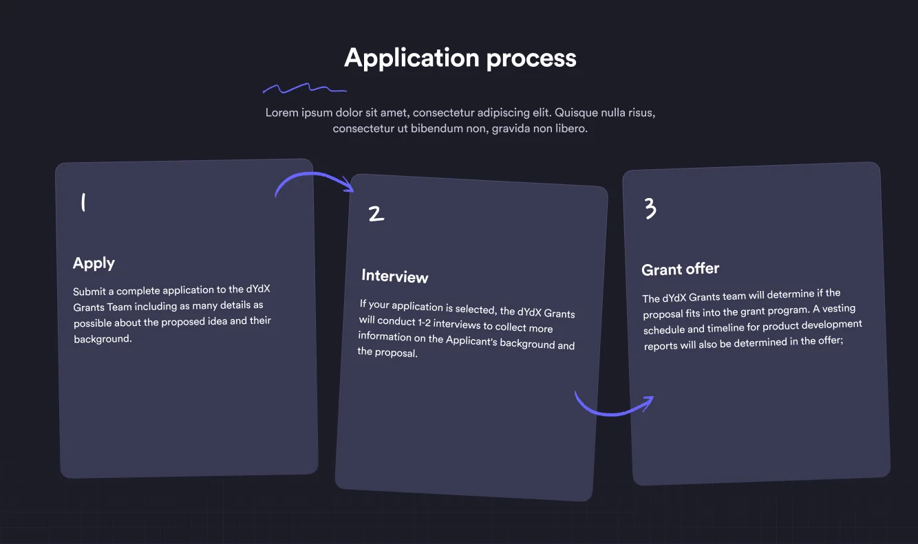
Above the cards, the “Application process” heading carries a hand-drawn wavy line, and the process itself appears as three slightly tilted cards with hand-written numerals and arrows between them: apply, interview, grant offer. Each step takes a sentence or two, covering what to send, what the interview is for and what the offer includes, so the path from idea to grant reads in a few seconds.
A closing call and the footer
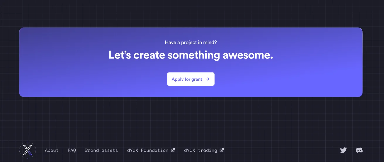
A banner with a violet gradient asks “Have a project in mind?” and leads to an “Apply for grant” button; the banner sits on the same grid as the rest of the page. The footer links to the about page, the FAQ, brand assets, the dYdX Foundation and the trading platform, with external links marked by an icon, and Twitter and Discord icons lead to social channels.
Results
The project's key outcomes in numbers.
- 6Home page screens
First screen, projects, news, questions, application process and a closing call to action in one scroll.
- 7FAQ questions
The accordion answers an applicant's main questions: timing, payouts, project criteria and US eligibility.
- 3Application steps
Apply, interview and grant offer appear as cards with hand-written numerals and arrows.
- 10 daysWork on the concept
The Figma mock-up of the home page took ten days.
Design & interfaces
Key screens and interfaces of the project.
Project tech stack
The stack we used to build the solution for the client's task.
- Figma
Similar cases
Ready to become the next case?
Tell us about your task — a manager will assemble the team, calculate the estimate and send a proposal within the first hour after the request. No obligations, no drip campaigns.