Valeriy Gradov — business card website for a lawyer
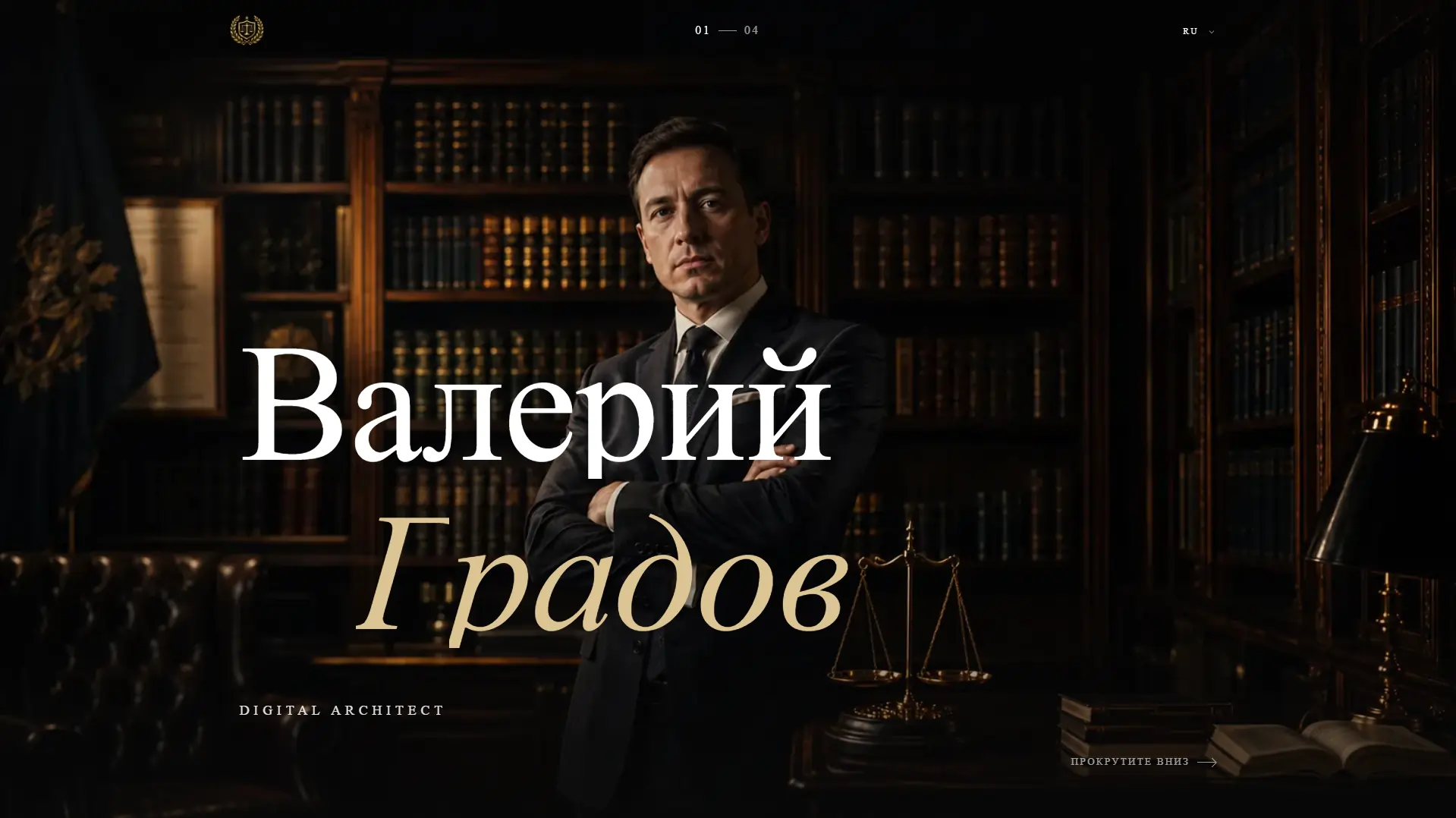
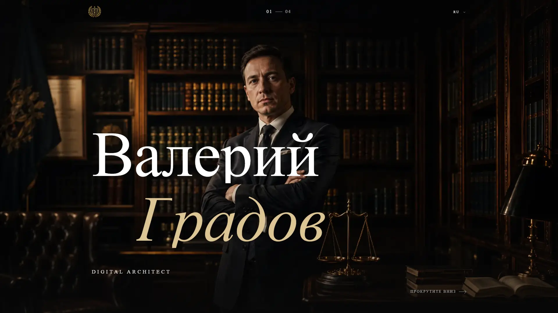
We built a four-screen business card website for private lawyer Valeriy Gradov: his practice in numbers, notable matters and direct contacts in three languages. Consultation bookings grew by 43%.
Challenge
Valeriy Gradov is a lawyer in private practice with more than 15 years of experience and over 320 cases. He handles corporate deals and M&A, property and tax disputes, and represents clients in international arbitration. His practice is built for business owners, boards, developers and investors.
A lawyer is chosen personally. Before getting in touch, a prospective client checks the specialist online: what he works on, at what level, and whether he can be trusted with a deal or a dispute. The business card website for the lawyer had to answer those questions from the very first screen: who he is and which matters to bring to him.
Confidentiality made experience harder to show. Client names are protected by agreements, so the usual portfolio row of logos was out of the question. Experience had to come through another way: the nature of the mandate, the sector, the forum, the year and the outcome, without naming a single party.
The practice itself is broad: corporate law and M&A, real estate disputes, tax defence and international arbitration. There is plenty to say about each area, from the scope of services to the working process and who it suits. Yet a long page of legal text tires the reader and buries the point, while a business card site has to stay short and calm.
Finally, clients speak different languages, and part of the work involves foreign jurisdictions and arbitration under ICC, LCIA and SCC rules. The site had to speak Russian, English and Uzbek, with the path to a consultation taking one step and no questionnaires: people prefer to discuss a sensitive matter directly, by email or in a messenger.
Solution
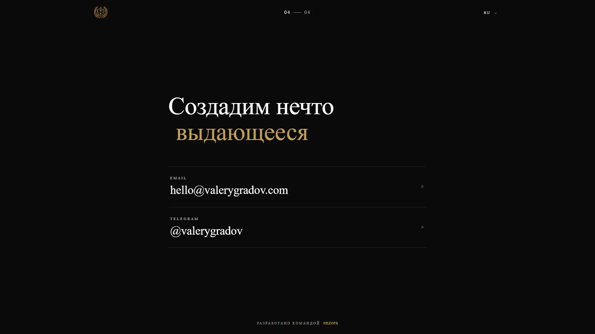
We split the site into four screens with a 01 — 04 indicator in the header: name and portrait, legal practice, notable mandates and contacts. A dark palette, gold accents and the Cormorant Garamond serif set the tone of a lawyer's office rather than an advertising landing page, and each screen carries a single idea.
Practice areas and mandates open in side panels: what the work includes, how it runs step by step and who it suits, and for each matter the role, forum, duration and outcome. The button at the bottom of every panel creates an email to the lawyer straight away, and the last screen offers email and Telegram, so a consultation can be booked from anywhere on the site.
Technically, the site is a single-page application on React and TypeScript, with Vite doing the build and Vercel the hosting. Animations run on GSAP: practice figures count up, headings reveal line by line, and when reduced motion is enabled in the system, everything appears in its final state at once. The copy for each language lives in its own dictionary and loads only when that language is chosen.
Legal practice in numbers
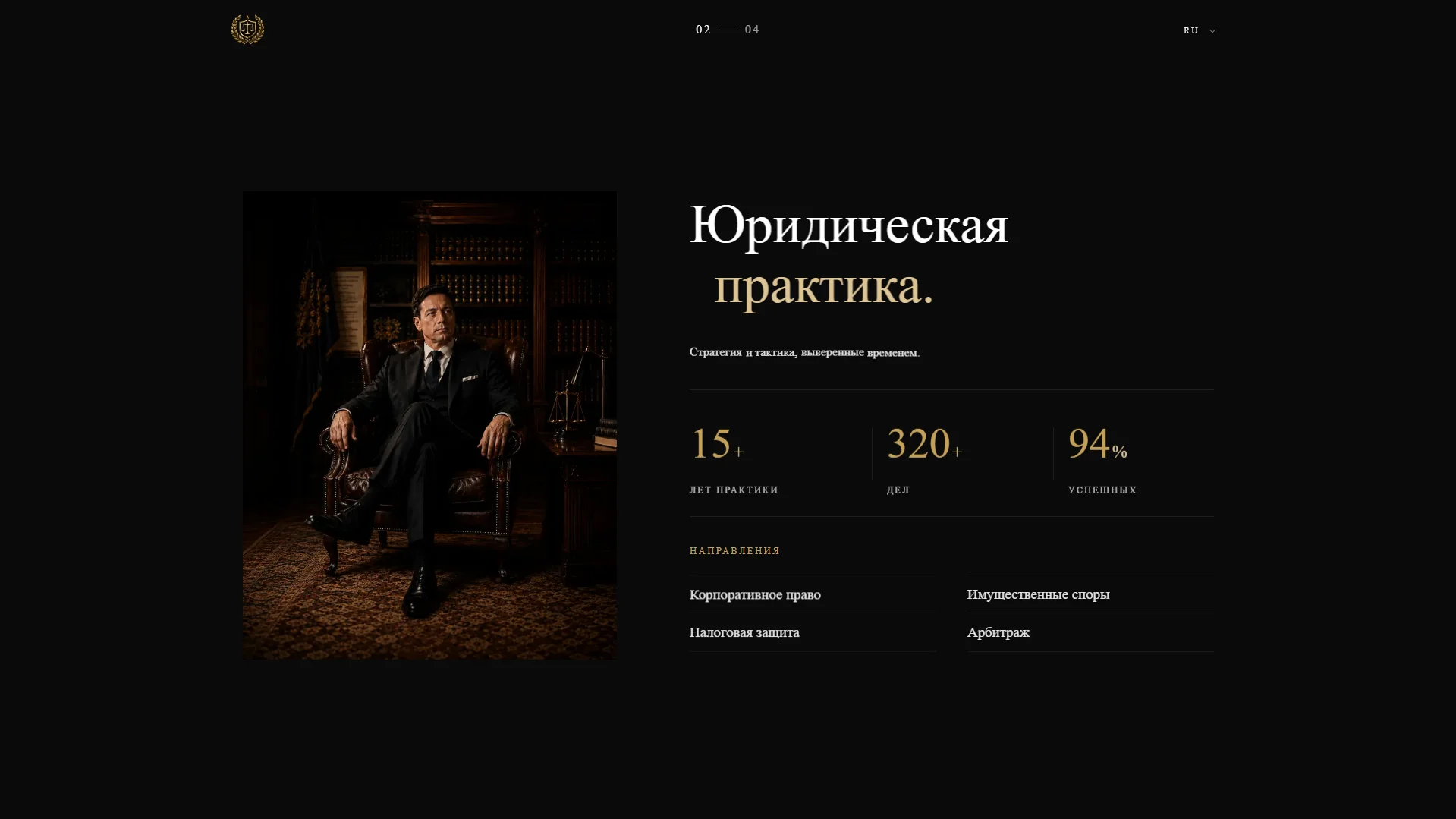
The second screen shows the essentials: more than 15 years of practice and 320+ cases in counters that come alive on scroll, plus four practice areas — corporate law, real estate disputes, tax defence and arbitration. Beside them, a portrait of the lawyer in his office subtly follows the cursor on a desktop.
Practice areas in side panels
Each area opens in a side panel without leaving the screen. It holds four “What's included” points, four “How we work” steps, an “Ideal for” list and a short promise from the lawyer. A visitor checks their situation against the practice and sees at once which matters belong here.
Mandates without client names
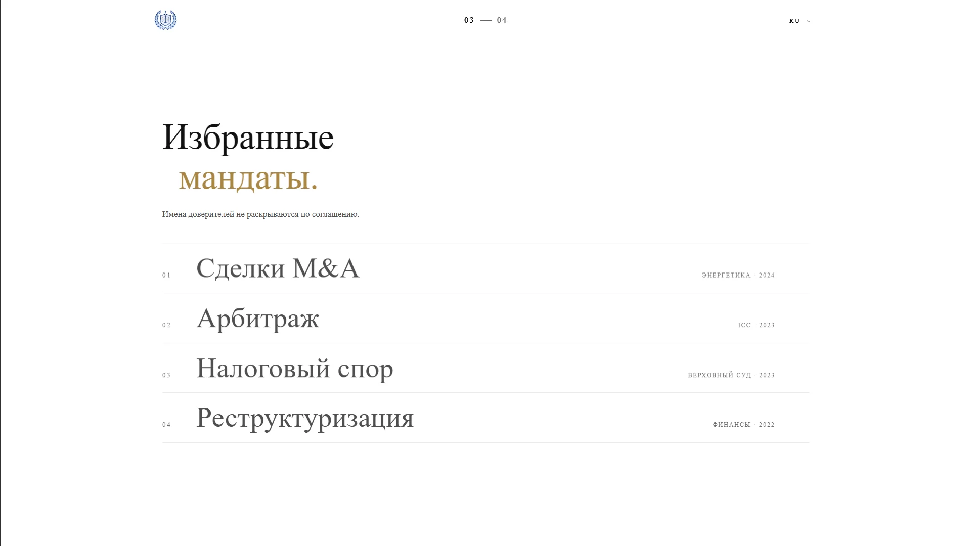
The “Notable mandates” section presents four matters: a cross-border M&A deal in energy, an ICC arbitration, a tax dispute at the Supreme Court and the debt restructuring of a financial holding. Instead of names there are the sector, year, the lawyer's role, forum and duration, while each panel adds approach and outcome.
Booking without questionnaires
We replaced a long questionnaire with direct channels. The button in each panel opens an email already addressed to the lawyer, and the contacts screen offers email and Telegram, with the link on a phone going straight to the messenger. From interest to a consultation booking takes a single tap.
Three language versions
Russian, English and Uzbek versions switch from the header. The copy was adapted rather than translated word for word: in English the second screen is titled “Strategic counsel”, and service descriptions read naturally in each language. The dictionaries load separately and do not weigh down the first screen.
Motion that stays out of the way
Motion on the site is calm: the name on the first screen, heading lines and figures appear softly, and Lenis handles smooth scrolling. Cursor effects run only on a desktop, reduced motion shows everything at once, and a “Skip to content” link with labelled page regions helps screen reader users.
Results
The project's key outcomes in numbers.
- +43%Consultation bookings
A clear presentation of the practice and a contact button in every section increased consultation bookings.
- <1.5 sPage load
A Vite build with code splitting, served from the Vercel CDN, gets the site on screen in less than 1.5 seconds.
- 3Website languages
Russian, English and Uzbek for clients at home and abroad, switched from the header.
- 4 daysTime to launch
The business card website went from the first layout to publication in four days.
Design & interfaces
Key screens and interfaces of the project.
Project tech stack
The stack we used to build the solution for the client's task.
- Vercel
- TypeScript
- React
- GSAP
- Vite
Ready to become the next case?
Tell us about your task — a manager will assemble the team, calculate the estimate and send a proposal within the first hour after the request. No obligations, no drip campaigns.