Synapse — landing page for clinic management software
We built a one-page website for Synapse, a clinic management system, with the product interface on the first screen, six key features and a short path to a demo. The page loads in under 1.5 seconds, and Lighthouse gives it 98 out of 100.
Challenge
Synapse is a Tashkent-based team developing Synapse Medical System, a clinic management platform covering electronic medical records, appointment scheduling, finances, medicine stock and lab integration. The product is aimed at the heads of clinics and medical centres.
Synapse Medical System brings medical records, patient scheduling, finances, stock and clinic paperwork into one product. A product like that is hard to sell with a paragraph of text: a clinic director needs to see within a couple of minutes that the system covers their needs. Hence the task: a medical software landing page that explains a complex product on one page and leads to a demo.
Medical organisations choose software carefully, because patient data and doctors' work, which cannot stop, are at stake. Generic promises do not work here. The page had to show the interface itself and explain honestly how the switch happens, so that a clinic would not fear downtime.
The page exists to generate demo requests. That means the way to the contacts had to be short from anywhere on the page rather than hidden in the footer, and the booking button had to stay within reach while a visitor reads about the features.
Interface screenshots, photos and animation make a page heavier, and it would be opened both on clinic workstations and on phones. The page had to keep loading fast and score high in Lighthouse despite its rich visuals, and the whole job had to fit into four days.
Solution
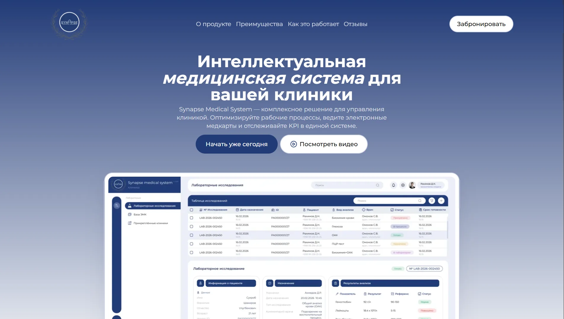
We assembled the page as a short product presentation. The first screen shows the real Synapse interface, a laboratory module with a table of tests and a results card. It is followed by three core advantages, a grid of six features, three onboarding steps, testimonials and contacts.
The Book button is pinned to the header and, together with the first-screen button, leads to the contacts block: headquarters in Tashkent, a phone line with office hours and an email for sales and support questions. Anchor navigation highlights the section being read, so it is easy to jump back to the right place.
The code is written in React and TypeScript, with Vite handling the build. Sections below the first screen load as separate chunks while the visitor scrolls, images are served as WebP with lazy loading, and Framer Motion reveal animations fire only when a block enters the viewport. Hosting is on Vercel.
A live interface up front
Instead of an abstract illustration, the first screen shows a working screen of the system: a table of lab tests with patients, doctors, statuses and due dates, and below it a card with the referral and test results set against reference ranges.
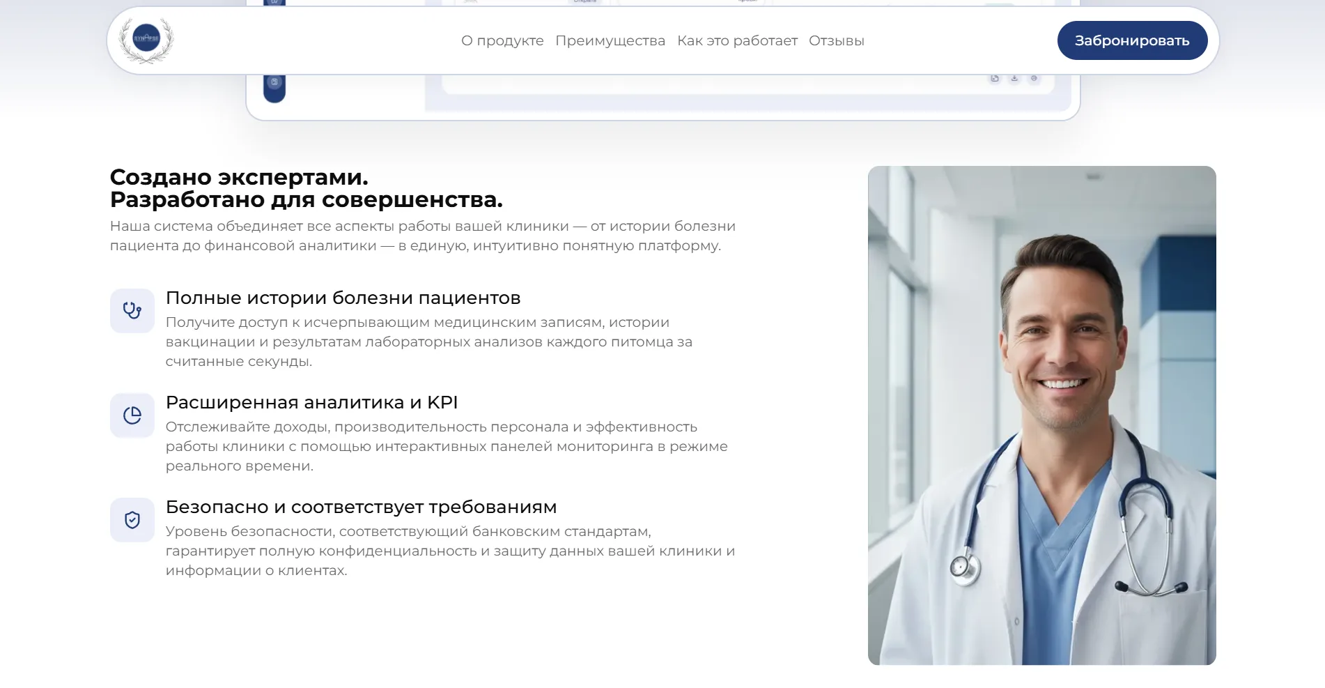
Three reasons to trust it
The “Built by experts” block answers a clinic's main questions in brief: a complete patient history, real-time analytics on revenue and staff workload, and data protection. A doctor's photo sits alongside, keeping the story about people rather than just software.
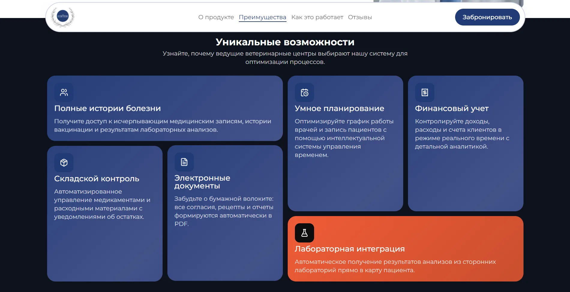
Six features in one grid
Medical records, smart doctor scheduling, financial accounting, medicine stock with low-level alerts, electronic documents in PDF and lab integration are laid out in a bento grid. Lab integration is highlighted with an accent colour.
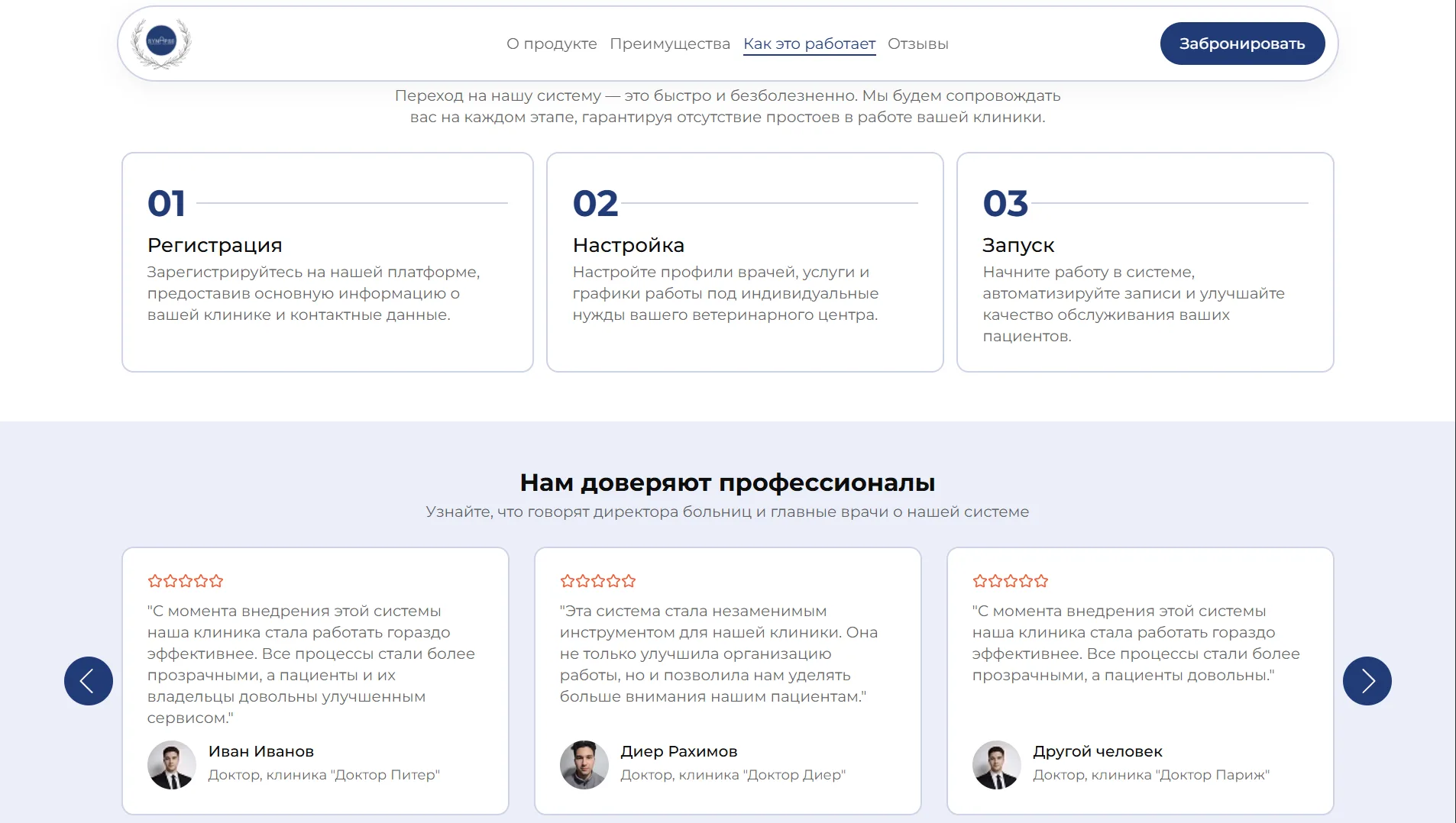
Switching in three steps
Registering the clinic, setting up doctor profiles, services and schedules, then going live: that is how the “How it works” section presents the rollout. A short scheme eases the fear of a painful migration and long downtime.
A way to the demo from anywhere
The Book button stays pinned in the header, and the first-screen button leads to the same place: contacts with headquarters in Tashkent, office hours and the sales email. An interested clinic director never has to hunt for where to write.
A light page, rich visuals
Sections below the first screen load as separate modules, images arrive as WebP with deferred loading, and animations trigger only when a block appears. That is why a visually rich page opens quickly on a phone and on a clinic workstation alike.
Results
The project's key outcomes in numbers.
- 6Key product features
Records, scheduling, finance, stock, documents and lab integration share one bento grid.
- <1.5 sPage load
Sections and images load as the visitor scrolls, so the page opens in under a second and a half.
- 98/100Lighthouse score
An automated Lighthouse audit rated the landing page 98 out of 100.
- 4 daysKickoff to publication
The landing page went from kickoff to publication in four days.
Design & interfaces
Key screens and interfaces of the project.
Project tech stack
The stack we used to build the solution for the client's task.
- Vercel
- TypeScript
- React
- Vite

Ready to become the next case?
Tell us about your task — a manager will assemble the team, calculate the estimate and send a proposal within the first hour after the request. No obligations, no drip campaigns.