Style Mix — a corporate landing page
We built a corporate landing page for Style Mix: a slider with the brand's key messages, eight service lines, case studies, events, testimonials and a blog on one page. Lead conversion rose by 36%, and the page opens in under 1.5 seconds.
Challenge
Style Mix is a company that presents its brand and business services through a one-page website. The landing page brings together eight service lines, from consulting and digital business models to audit and strategic planning, and speaks to corporate clients in English.
Style Mix needed a corporate landing page that explains from the first screen who stands behind the brand and how the company helps businesses. It works in eight areas, from consulting to bonds, commodities and stocks, and on a single page such an offer easily turns into a dense price list that nobody reads to the end.
A list of services is not enough for a corporate client. Before leaving a request, they want to see the company's scale, real case studies and what other clients say, so that evidence had to be built into the page in a way that supports the offer rather than competing with it for attention.
The format added constraints of its own. One page had to hold a slider with key messages, an introduction to the company, services, case studies, events, testimonials and articles without turning into an endless feed with no rhythm or clear transitions between sections.
The landing page is opened on smartphones and on large monitors alike, so the layout had to keep its composition at any screen width. And the first screen with the slider had to appear quickly, before a visitor lost interest and closed the tab.
Solution
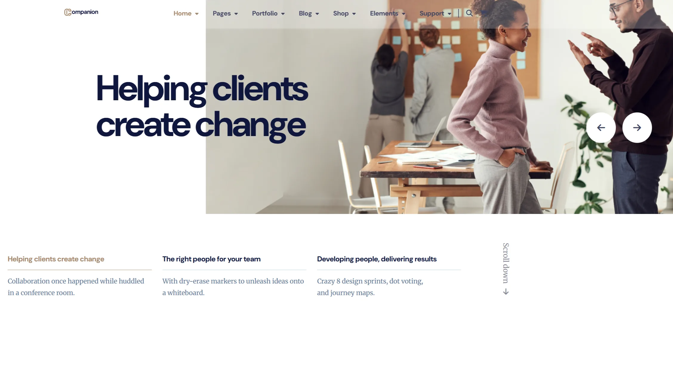
We structured the landing page as a sequential story about the company. The first screen is a slider of three key messages switched with arrows, with the active headline highlighted, followed by an About Us block with key figures, a numbered list of eight service lines and a strip of brand logos.
The middle of the page builds trust. In the case studies section the background changes when a visitor hovers over a project title, followed by event announcements, a testimonials slider and three recent blog posts. The page closes with a “What can we help you achieve?” block and a Let's Start button, while the footer holds useful links and a newsletter sign-up.
The page is hand-coded in HTML5 and CSS3 without heavy frameworks: the sliders run on jQuery and Owl Carousel, icons come from Font Awesome, and the typefaces are DM Sans and Merriweather. It is served from Vercel's CDN, and more than twenty media queries adapt the grid to screens from a smartphone to monitors wider than 4,000 pixels.
A slider with brand messages
The first screen rotates three messages about the company, each with its own photo. Visitors switch them with arrows while the headline of the active slide is highlighted alongside, so they can see how many messages lie ahead.
About the company, in figures
Below the slider the company briefly sets out its approach, and three large figures show the scale of its work. A scroll button on the first screen leads straight to this block, so the introduction starts with the essentials.
A numbered list of services
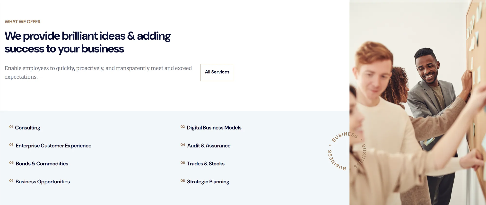
Services are gathered into a numbered list of eight items: consulting, digital business models, customer experience, audit, bonds and commodities, trading in stocks, business opportunities and strategic planning. Next to it sit a strip of brand logos and a link to all services.
Case studies with a changing backdrop
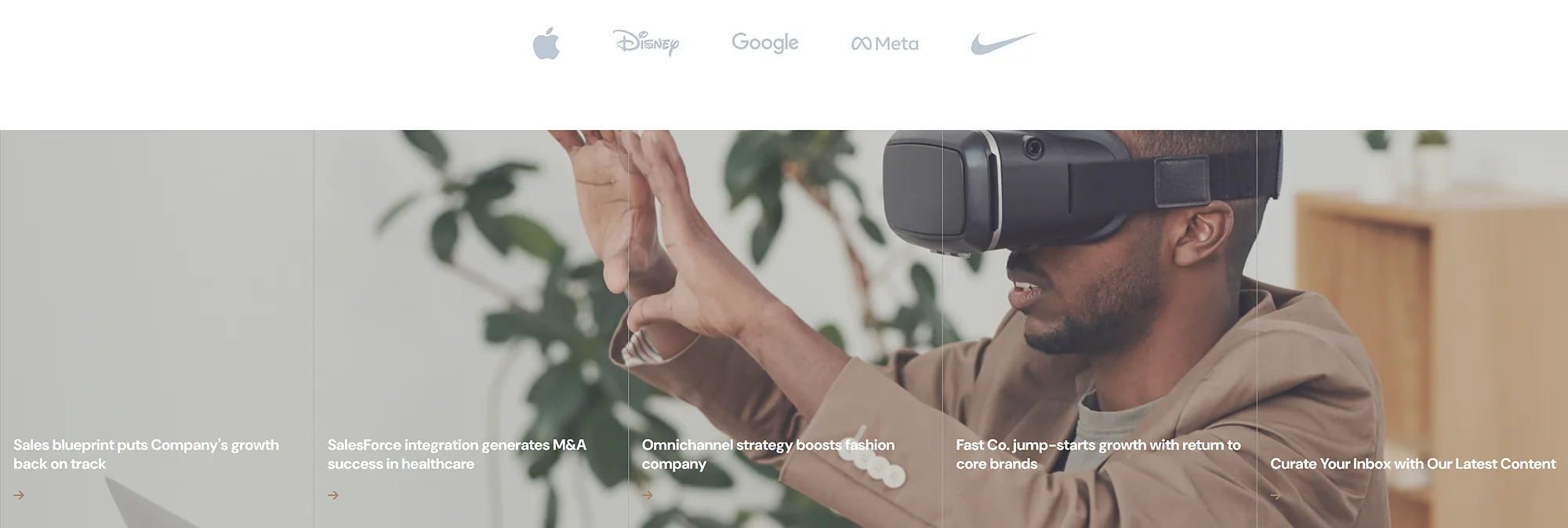
In the projects section five success stories are laid out as a list, and the background photo changes when a visitor hovers over a title. The block stays compact, yet every case gets a picture of its own.
Events, testimonials and a blog
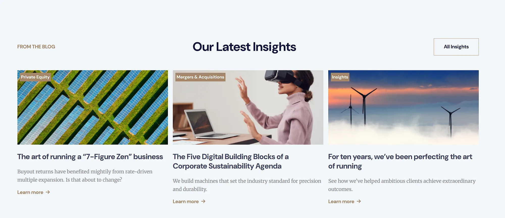
Announcements of upcoming events, a testimonials slider and three recent blog posts answer the trust question a corporate client has after reading about the services. The final block with the Let's Start button turns that interest into action.
A layout for any screen
The grid reflows at more than twenty breakpoints, from 400-pixel smartphones to monitors wider than 4,000 pixels. On a phone the menu folds into a burger, and the search field opens in a separate window over the page.
Results
The project's key outcomes in numbers.
- +36%Lead conversion
The share of visitors who go on to leave a request grew after the landing page went live.
- <1.5 sPage load
Static markup without heavy frameworks is served from Vercel's CDN and opens in under one and a half seconds.
- 7Sections on one page
Slider, about, services, case studies, events, testimonials and a blog with a closing call to action.
- 4 daysFrom kickoff to launch
Building seven sections, two sliders and the adaptive layout took four days.
Design & interfaces
Key screens and interfaces of the project.
Project tech stack
The stack we used to build the solution for the client's task.
- Vercel
- HTML5
- CSS3
- JavaScript
Similar cases
Ready to become the next case?
Tell us about your task — a manager will assemble the team, calculate the estimate and send a proposal within the first hour after the request. No obligations, no drip campaigns.