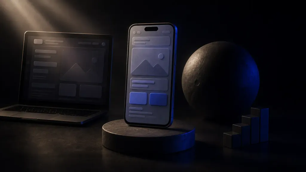
Why the phone matters more than desktop today
If your site looks great on a computer but is awkward on a phone, you lose most of your clients without even noticing. In most niches, 60–80% of visitors come from mobile devices. People look for services on the road, in a queue, on the couch before sleep — and make the "submit or leave" decision on a small screen, often with one hand.
Google accounted for this long ago. With the shift to mobile-first indexing, the engine evaluates the mobile version first. That means: if the site is awkward or slow on a phone, both users and search positions suffer — even for those who visit from a computer.
The mobile version today isn't an "add-on to the site" but its foundation. It's where a client's acquaintance with your business begins.
What makes a mobile version truly convenient
Readability without zooming
Text must be large enough that you don't have to enlarge it. Buttons big enough for a finger, and interactive elements not stuck together. If the user has to "zoom" the page to tap something — that's a bad sign.
Speed on mobile internet
A phone often runs on an unstable or slow network. This is exactly where lightweight pages, optimized images and caching are critical. Slow loading on mobile kills conversion fastest.
Convenient forms
Short forms, correct field types (a phone keypad for a number, a numeric one for a postal code), autofill, a minimum of required fields — everything that reduces effort and friction when submitting a request.
A noticeable call to action
A "Call," "Message" or "Submit a request" button should always be at hand — ideally fixed at the bottom of the screen so you don't need to scroll far to reach it.
Thumb-friendly navigation
Important elements within reach of the thumb. Menus, buttons and links should open easily, without precise aiming.
A mobile version checklist
| Element | How it should be |
|---|---|
| Text | Readable without zooming |
| Buttons | Large, finger-friendly |
| Speed | Fast loading on a mobile network |
| Forms | Short, with the right keyboard |
| CTA | Noticeable, always at hand |
| Images | Light, adapted to the screen |
| Navigation | Simple, in the thumb zone |
Common mistakes that scare off mobile clients
- tiny text and tiny buttons impossible to hit;
- full-screen pop-ups that are hard to close;
- horizontal scrolling from a non-responsive layout;
- heavy images that load slowly on a mobile network;
- long forms with a dozen required fields;
- important buttons hidden deep at the bottom of the page.
Responsive design vs a separate mobile version
In the past people sometimes built a separate mobile version (on an m. subdomain). The modern and correct approach is responsive design: one site that adapts itself to any screen, from a smartphone to a large monitor.
Responsive design is easier to maintain (one site instead of two), better for SEO (one address, one set of pages) and provides a unified experience across all devices. That's why both search engines and professional studios recommend it.
How to check your site's mobile version
- Open the site on your own phone and try to walk the whole customer journey: find a service, read the terms, submit a request — with one hand.
- Check speed via PageSpeed Insights specifically for mobile.
- Look in Search Console at the mobile usability report.
- Ask a friend to perform a simple action on the site from a phone and watch where they get stuck.
If something is inconvenient for you — it's inconvenient for the client too, and they'll simply leave for a competitor.
Frequently asked questions
What is mobile-first indexing?
It's the principle by which Google evaluates and ranks a site primarily by its mobile version. Even if most of your clients are on computers, the quality of the mobile version affects positions for everyone.
Do I need a separate mobile version?
No, the modern and recommended solution is responsive design: one site that adapts to any screen. It's easier to maintain and better for SEO than a separate mobile version.
My site opens on a phone — does that mean it's mobile-friendly?
Not necessarily. "Opens" and "is convenient" are different things. If you have to zoom the page, the buttons are small and the forms are awkward — the site formally works, but it loses clients.
Conclusion
The mobile version isn't a secondary detail but the main channel through which most clients first meet your business. A fast, convenient, responsive site on a phone keeps visitors, raises conversion and helps in search. An awkward mobile site silently hands clients to competitors.
At Enzora we design sites mobile-first: we first work out convenience and speed on a phone, then expand the interface to desktop. That way you don't lose most of your audience — you turn it into clients. Want to check how convenient your site is on mobile? We'll run an audit and show the growth points.